B2C mobile app
EdTech / Language learning
Duolingo
In this project, I explored how Duolingo could better support learners who struggle to stay consistent with daily practice. Many users download the app with excitement, but drop off after the first weeks due to time pressure or loss of motivation.
My focus was on redesigning the daily practice flow to fit into short, busy moments. I worked on creating a Quick Practice Mode that delivers meaningful micro-learning in just a few minutes while still rewarding progress.
The design emphasized flexibility, motivation, and simplicity — helping learners maintain their streaks, reduce frustration, and feel a sense of achievement every day, even when they don’t have time for a full lesson.
Daily Practice Flow
Quick Practice
For this project, I redesigned the daily practice flow in Duolingo to help learners stay consistent with their studies. Research showed that many users were losing motivation and dropping their streaks after the first week, often because lessons required too much time to complete.
Quick & Flexible
Complete a meaningful practice session in under 3 minutes — designed for learners with busy schedules.
Streak Protection
Keep your streak alive with short sessions that still count towards daily progress.
Stay motivated
Earn XP, gems, and badges even in Quick Practice Mode to feel rewarded every day.
Short challenges, playful characters, and instant feedback keep the experience enjoyable.
Fun & Engaging
Project overview
Duolingo is a mobile-first, habit-forming learning product where daily engagement and streak retention are core to long-term user success.
As a Product Designer on the Duolingo team, I worked on improving the daily practice experience for learners with limited time, focusing on retention, motivation, and streak continuity.
User research and behavioral data revealed that many mid-stage learners were breaking their streaks not due to lack of interest, but because full lessons felt too time-consuming on busy days. To address this, I helped design Quick Practice Mode — a lightweight, ~3-minute practice session that users could start in one tap directly from the home screen.
In parallel, I worked on the streak zones and milestone experience, designing how progress is tracked, visualized, and emotionally reinforced as users maintain consecutive-day streaks. This included UX logic for streak progression, milestone thresholds (e.g. 3-day, 7-day streaks), and UI patterns such as celebratory animations, reward states, and contextual feedback.
I owned the design end-to-end — from user flows and progress logic to interaction design, animations, and high-fidelity UI — collaborating closely with product and engineering to ensure the experience felt motivating, clear, and consistent with Duolingo’s playful brand while supporting measurable retention goals.


Design Challenge
1
Setting the next meaningful streak goal
Users with long streaks often lose motivation after reaching an initial milestone. Once the excitement of “keeping the streak alive” fades, the product needs a new reason for users to continue practicing consistently.
I designed a goal-setting experience that reframes streaks from a passive counter into an active commitment. Instead of stopping at the current streak, users are encouraged to select a next streak milestone (7, 14, 30, 50 days), with clear qualitative feedback that reinforces progress and confidence.
This step turns streaks into a forward-looking goal rather than a past achievement.

2
Maintaining momentum between milestone
A key drop-off moment happens between streak milestones, when progress feels slow or abstract. Users may still be practicing daily, but without a visible sense of advancement, motivation declines.
To address this, I designed a progressive milestone system that visualizes how close users are to their next streak goal. The experience uses clear visual hierarchy, incremental progress markers, and encouraging microcopy to sustain momentum and answer a simple question:
“Am I getting closer?”
This keeps users emotionally invested even when the next reward is days away.

3
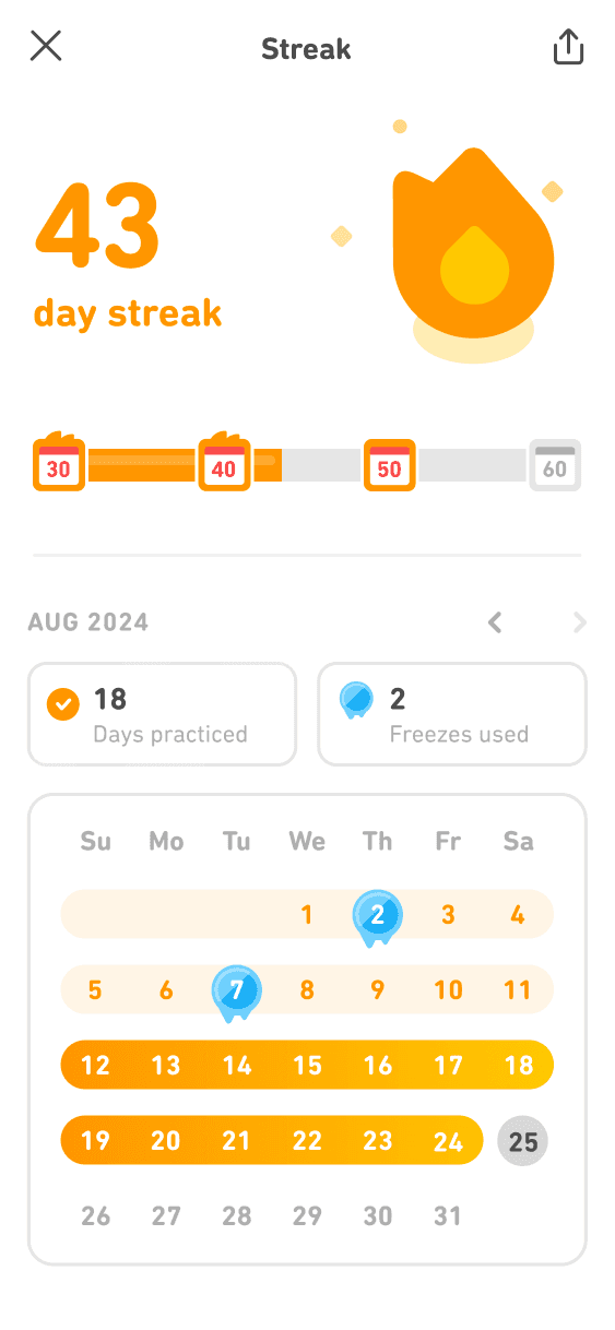
Making streak progress visible and trustworthy
For streaks to feel meaningful, users must trust that their effort is being accurately tracked and recognized over time. Without transparency, streaks can feel fragile or arbitrary.
I worked on the streak tracking experience, combining calendar-based visualization with streak status, freeze usage, and day-by-day confirmation. This gives users a clear historical view of their effort and reinforces a sense of ownership over their learning habit.
The result is a streak system that feels reliable, motivating, and emotionally rewarding rather than stressful.
Research: Understanding Streak Behavior & Daily Practice Motivation
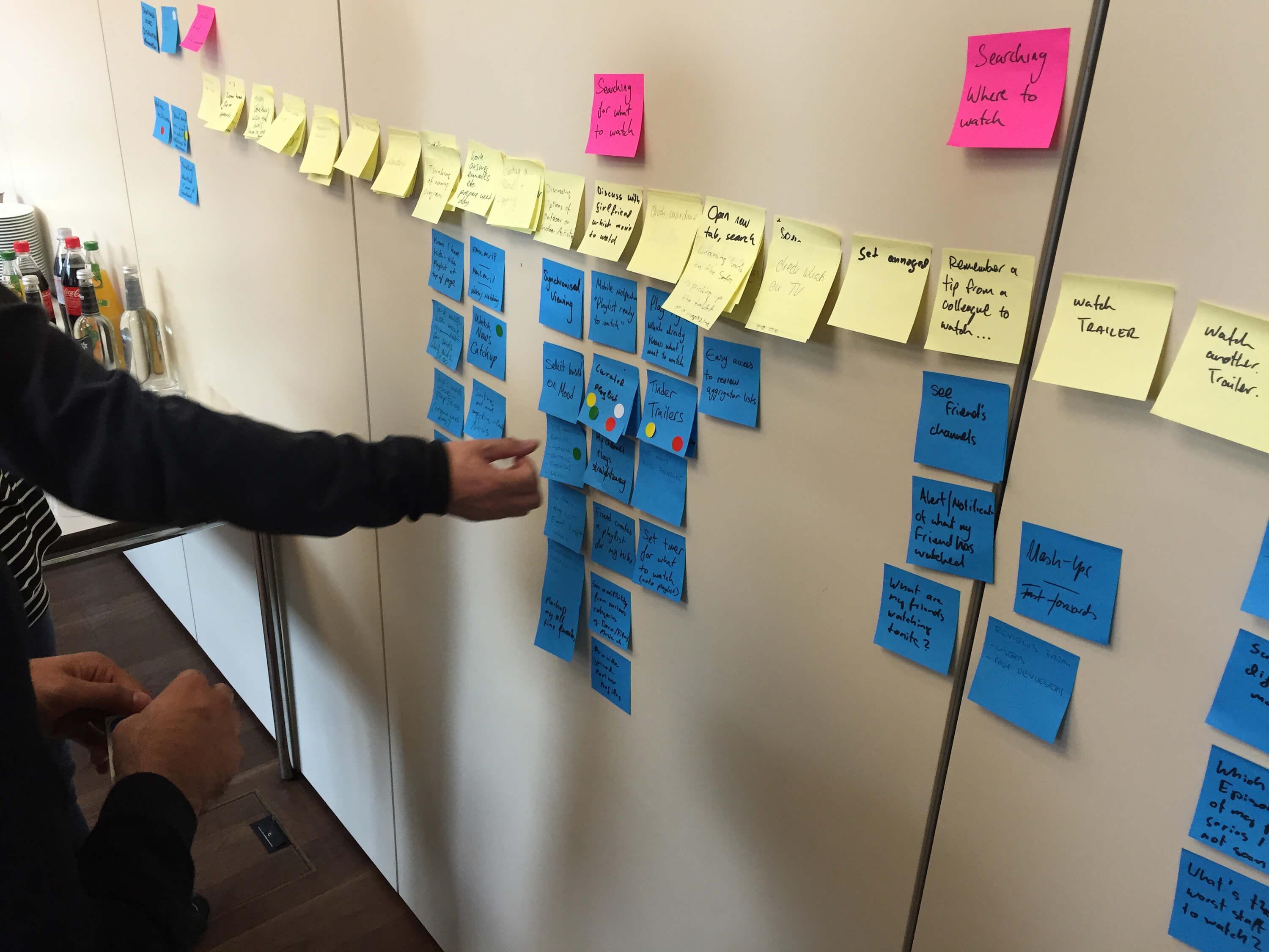
Using research insights, I explored early concepts for Quick Practice Mode and streak progression through low-fidelity sketches and whiteboard flows. I focused on how goal-setting, milestones, and feedback could fit naturally into existing user routines while minimizing friction. Working closely with product and engineering, we aligned on constraints and iterated on multiple directions before translating the strongest concepts into interactive Figma prototypes.

User Persona
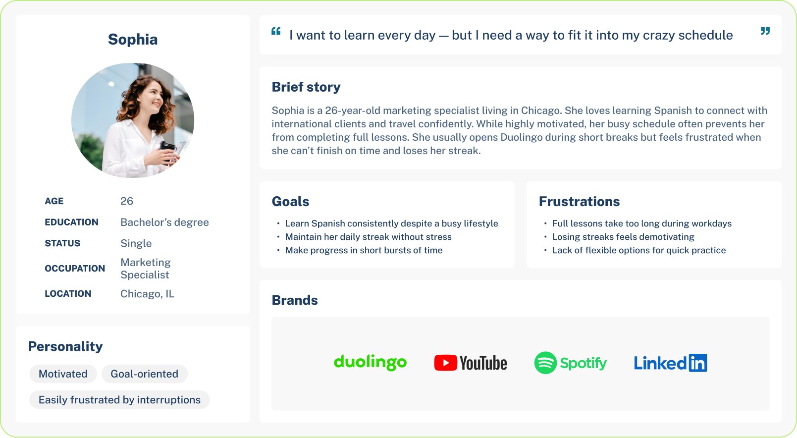
To better understand the challenges learners face, I developed a persona that represents a typical Duolingo user. This persona highlights the daily struggles of balancing language learning with a busy schedule, and shows where frustration often leads to dropped streaks.
By focusing on her motivations and pain points, I was able to design a practice flow that feels lighter, faster, and more rewarding — making it easier for her to stay engaged over time.
User Journey Map
I analyzed how learners interact with Duolingo throughout a typical day. From the first moment they open the app in the morning to the final check of their streak at night, the journey shows both motivation and frustration.
The map exposed critical drop-off points — especially when users felt they didn’t have enough time for a full lesson. It also highlighted moments of excitement when progress and rewards were clear. These insights shaped the idea of a Quick Practice Mode, designed to reduce time pressure and make daily learning more achievable.
Information Architecture & User Flow
This flow was designed to remove friction at the exact moment users hesitate to start a full lesson. From the home screen, Quick Practice is positioned as an immediate, one-tap entry into a short session that preserves streaks without requiring a long time commitment. The flow prioritizes speed, clarity, and positive reinforcement — guiding users from intent to completion in under a few minutes, then closing the loop with clear progress and motivational feedback.
Start
Home Screen
Quick Practice Start
Mini Exercise
Completion Screen
Motivational Feedback
Information Architecture/User Flow
Home Screen → User opens the app and sees the new Quick Practice button.
Quick Practice Start → One tap to begin a 3-minute session.
Mini Exercise → Short set of tasks (1–2 questions with fast interactions).
Completion Screen → Shows streak continued, XP earned, gems collected.
Motivational Feedback → Duo the Owl celebrates and encourages the learner.
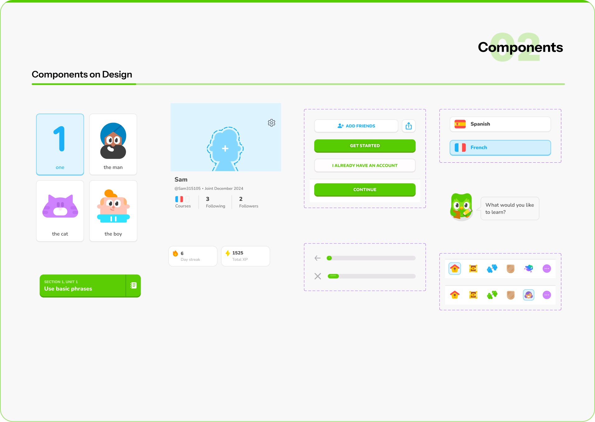
Design System
While working on Quick Practice Mode, I had to make sure the new flow felt like it truly belonged inside Duolingo. The app has a very strong identity — bright colors, playful illustrations, and Duo the owl driving most interactions. My task was to extend this system without breaking its character.
Colors
Duolingo Green remained dominant, but I introduced a softer yellow accent to signal speed and . short sessions. This created a visual distinction between regular lessons and quick practice.
Typography
Duolingo Sans was kept for consistency, but I prioritized large, bold headlines and reduced text density so users could scan information in seconds.
Components
I designed simplified buttons and micro-progress bars that worked for shorter lessons. Instead of long progress trackers, users saw small step indicators that matched the 3-minute flow.
Mascot & Illustrations
Duo was integrated as a motivator — appearing at the start and end of Quick Practice with supportive messages. These lightweight interactions reinforced the brand’s playful voice while keeping learners engaged.
By adapting the existing system and adding subtle extensions, the new design stayed true to Duolingo’s personality while delivering a fresh, faster experience.

High Fidelity Wireframes
At the high-fidelity stage, I focused on how streak progress, rewards, and goal-setting are visually and emotionally communicated during short practice sessions.
The first interaction introduces the Streak Zone, where users see their current streak and upcoming milestones. This screen is designed to immediately reinforce progress and set a clear expectation of what comes next, turning the streak into an active journey rather than a static number.
The second state highlights reward moments, such as earned gems or XP, to create a sense of accomplishment after completing a short session. Visual emphasis, motion, and hierarchy were used to make rewards feel meaningful without overwhelming the user.
The final flow guides users into setting or committing to the next streak goal, presenting milestone options with clear value and tone-based feedback (e.g. “Good,” “Great,” “Unstoppable”). This step closes the loop by encouraging continued commitment while respecting the user’s available time and effort.
Together, these interactions create a lightweight but motivating experience that supports daily consistency, protects streaks, and reinforces habit formation through clear feedback and positive reinforcement.
High-Fidelity Wireframes


User Testing
To validate Quick Practice Mode, I ran usability testing with 8 learners across different backgrounds, including busy professionals, students, and casual users.
Participants completed a 3-minute practice session using a think-aloud method, followed by short interviews to capture feedback and pain points.
Key Insights
Users immediately understood Quick Practice as a faster alternative to regular lessons.
Streak protection was the strongest motivator, especially for users with limited time.
The simplified progress bar helped users clearly understand time remaining.
Some users expected clearer streak confirmation after completing the session.
Outcome
Based on these insights, I refined the completion screen by emphasizing streak continuation and adding a streak badge next to XP rewards, reducing confusion and increasing confidence after each session.

Feedback Summary
After reviewing the high-fidelity prototype of Quick Practice Mode, I gathered qualitative feedback from learners with different goals and experience levels.
The feedback helped validate what was working well and revealed clear opportunities to improve clarity, motivation, and personalization. These insights directly guided the next iteration of the experience.
Final Designs
The final designs translate Quick Practice Mode into a fast, focused experience that fits naturally into Duolingo’s core learning flow.
The goal was to help learners stay consistent on busy days by reducing friction while preserving Duolingo’s playful tone.
Key Design Decisions
One-tap entry to Quick Practice from the home screen to reduce time-to-start.
3-minute sessions built around lightweight exercises and a clear micro-progress bar.
Clear end-of-session rewards, combining XP, streak protection, and gems in a single confirmation moment.
Motivational feedback from Duo to reinforce completion and positive momentum.
These designs balance speed, clarity, and motivation, making daily practice feel achievable without sacrificing engagement.

Final Solution: A Clearer, Friendlier Duolingo Experience
The redesigned Quick Practice flow focused on reducing friction and cognitive load while making progress and rewards more visible.
By simplifying navigation, surfacing progress upfront, and clarifying end-of-session feedback, learners could move through practice sessions more smoothly and with greater confidence.
Clear visual hierarchy, consistent interactions, and improved contrast helped create a cleaner, more approachable experience without losing Duolingo’s playful character.
Outcome & Impact
Usability testing with 8 learners showed clear improvements across key metrics:
Lesson navigation: Task completion improved by 28%, with users finding practice faster.
Progress clarity: 90% of participants clearly understood their streak and XP goals (up from 65%).
Exercise completion: Error rates across the task flow dropped by 25%.
Overall perception: Users described the experience as “cleaner” and “less overwhelming.”
Satisfaction score: Increased from 3.4 → 4.7 / 5.
Impact
By leading the redesign process from early sketches to high-fidelity mockups, I created a simplified learning journey that reduced user frustration and increased engagement. Multiple testing rounds helped validate design changes and refine the flow before final implementation.
This process not only improved Duolingo’s learning experience but also gave me hands-on experience with rapid iteration, usability testing, and presenting results in a measurable way.
What I learned
Clarity over complexity: Simplifying the lesson path made the app easier for both beginners and advanced learners.
Microcopy matters: Small changes in labels (like “Continue lesson” instead of “Start”) improved understanding.
Consistency builds trust: Keeping icons, buttons, and progress indicators consistent across screens reduced confusion.
Test early, test often: Even low-fi prototypes gave valuable feedback before moving into polished visuals.
Accessibility = inclusivity: Adjusting colors, contrasts, and touch targets improved usability across all devices.
B2C mobile app
EdTech / Language learning
Duolingo
Helping busy learners stay consistent with daily practice by redesigning Duolingo’s quick learning flow.
Focused on flexibility, motivation, and simplicity to help learners maintain streaks and make progress in just a few minutes a day.
Daily Practice Flow
Quick Practice
For this project, I redesigned the daily practice flow in Duolingo to help learners stay consistent with their studies. Research showed that many users were losing motivation and dropping their streaks after the first week, often because lessons required too much time to complete.
Quick & Flexible
Complete a meaningful practice session in under 3 minutes — designed for learners with busy schedules.
Streak Protection
Keep your streak alive with short sessions that still count towards daily progress.
Stay motivated
Earn XP, gems, and badges even in Quick Practice Mode to feel rewarded every day.
Short challenges, playful characters, and instant feedback keep the experience enjoyable.
Fun & Engaging
Duolingo is a mobile-first, habit-forming learning product where daily engagement and streak retention are core to long-term user success.
As a Product Designer on the Duolingo team, I worked on improving the daily practice experience for learners with limited time, focusing on retention, motivation, and streak continuity.
User research and behavioral data revealed that many mid-stage learners were breaking their streaks not due to lack of interest, but because full lessons felt too time-consuming on busy days. To address this, I helped design Quick Practice Mode — a lightweight, ~3-minute practice session that users could start in one tap directly from the home screen.
In parallel, I worked on the streak zones and milestone experience, designing how progress is tracked, visualized, and emotionally reinforced as users maintain consecutive-day streaks. This included UX logic for streak progression, milestone thresholds (e.g. 3-day, 7-day streaks), and UI patterns such as celebratory animations, reward states, and contextual feedback.
I owned the design end-to-end — from user flows and progress logic to interaction design, animations, and high-fidelity UI — collaborating closely with product and engineering to ensure the experience felt motivating, clear, and consistent with Duolingo’s playful brand while supporting measurable retention goals.
Project overview
Design Challenge
1
Setting the next meaningful streak goal
Users with long streaks often lose motivation after reaching an initial milestone. Once the excitement of “keeping the streak alive” fades, the product needs a new reason for users to continue practicing consistently.
I designed a goal-setting experience that reframes streaks from a passive counter into an active commitment. Instead of stopping at the current streak, users are encouraged to select a next streak milestone (7, 14, 30, 50 days), with clear qualitative feedback that reinforces progress and confidence.
This step turns streaks into a forward-looking goal rather than a past achievement.
2
Maintaining momentum between milestones
A key drop-off moment happens between streak milestones, when progress feels slow or abstract. Users may still be practicing daily, but without a visible sense of advancement, motivation declines.
To address this, I designed a progressive milestone system that visualizes how close users are to their next streak goal. The experience uses clear visual hierarchy, incremental progress markers, and encouraging microcopy to sustain momentum and answer a simple question:
“Am I getting closer?”
This keeps users emotionally invested even when the next reward is days away.
3
Making streak progress visible and trustworthy
For streaks to feel meaningful, users must trust that their effort is being accurately tracked and recognized over time. Without transparency, streaks can feel fragile or arbitrary.
I worked on the streak tracking experience, combining calendar-based visualization with streak status, freeze usage, and day-by-day confirmation. This gives users a clear historical view of their effort and reinforces a sense of ownership over their learning habit.
The result is a streak system that feels reliable, motivating, and emotionally rewarding rather than stressful.
Using research insights, I explored early concepts for Quick Practice Mode and streak progression through low-fidelity sketches and whiteboard flows. I focused on how goal-setting, milestones, and feedback could fit naturally into existing user routines while minimizing friction. Working closely with product and engineering, we aligned on constraints and iterated on multiple directions before translating the strongest concepts into interactive Figma prototypes.
Research: Understanding Streak Behavior & Daily Practice Motivation
User Persona
To better understand the challenges learners face, I developed a persona that represents a typical Duolingo user. This persona highlights the daily struggles of balancing language learning with a busy schedule, and shows where frustration often leads to dropped streaks.
By focusing on her motivations and pain points, I was able to design a practice flow that feels lighter, faster, and more rewarding — making it easier for her to stay engaged over time.
Sophia

Age
26
Education
Bachelor’s degree
Status
Single
Occupation
Marketing Specialist
Location
Chicago, IL
Personality
Motivated
Goal-oriented
Easily frustrated by interruptions
I want to learn every day — but I need a way to fit it into my crazy schedule
Brief story
Sophia is a 26-year-old marketing specialist living in Chicago. She loves learning Spanish to connect with international clients and travel confidently. While highly motivated, her busy schedule often prevents her from completing full lessons. She usually opens Duolingo during short breaks but feels frustrated when she can’t finish on time and loses her streak.
Goals
Learn Spanish consistently despite a busy lifestyle
Maintain her daily streak without stress
Make progress in short bursts of time
Frustrations
Full lessons take too long during workdays
Losing streaks feels demotivating
Lack of flexible options for quick practice
Brands
User Journey Map
I analyzed how learners interact with Duolingo throughout a typical day. From the first moment they open the app in the morning to the final check of their streak at night, the journey shows both motivation and frustration.
The map exposed critical drop-off points — especially when users felt they didn’t have enough time for a full lesson. It also highlighted moments of excitement when progress and rewards were clear. These insights shaped the idea of a Quick Practice Mode, designed to reduce time pressure and make daily learning more achievable.
OPPORTUNITIES
01
Provide faster access to Quick Practice from home screen.
02
Allow streak protection with short sessions.
03
Show instant rewards to keep motivation high.
04
Create lightweight progress tracking that feels achievable.
THOUGHTS
I want to keep my streak but I don’t have 15 minutes right now.
kipping today will make me lose progress.
Quick Practice is short enough, I can do this.
Nice! I still earned XP and kept my streak alive.
DOING
Action 1
Opens Duolingo before work, checks streak.
Action 2
Sees a regular lesson feels too long, hesitates to start.
Action 3
Switches to Quick Practice Mode, completes short session.
Action 4
Gets rewarded with XP and streak, ends the day satisfied.
EMOTIONS
RELIEVED
MOTIVATED
HOPEFUL
FRUSTRATED


Sophia
Marketing Specialist
Single, 26 years old
Chicago, Il
SCENARIO Sophia wants to keep learning Spanish while balancing her demanding job. She often struggles to complete full lessons during busy weekdays but doesn’t want to lose her streak.
1. Learn Spanish consistently despite limited time. 2. Maintain her daily streak without stress. 3. Feel rewarded even after short practice. 4. Fit language learning into busy routines.
GOALS
Information Architecture & User Flow
This flow was designed to remove friction at the exact moment users hesitate to start a full lesson. From the home screen, Quick Practice is positioned as an immediate, one-tap entry into a short session that preserves streaks without requiring a long time commitment. The flow prioritizes speed, clarity, and positive reinforcement — guiding users from intent to completion in under a few minutes, then closing the loop with clear progress and motivational feedback.
Start
Home Screen
Quick Practice Start
Mini Exercise
Completion Screen
Motivational Feedback
Information Architecture/User Flow
Home Screen → User opens the app and sees the new Quick Practice button.
Quick Practice Start → One tap to begin a 3-minute session.
Mini Exercise → Short set of tasks (1–2 questions with fast interactions).
Completion Screen → Shows streak continued, XP earned, gems collected.
Motivational Feedback → Duo the Owl celebrates and encourages the learner.
Design System
While working on Quick Practice Mode, I had to make sure the new flow felt like it truly belonged inside Duolingo. The app has a very strong identity — bright colors, playful illustrations, and Duo the owl driving most interactions. My task was to extend this system without breaking its character.
Colors
Duolingo Green remained dominant, but I introduced a softer yellow accent to signal speed and . short sessions. This created a visual distinction between regular lessons and quick practice.
Typography
Duolingo Sans was kept for consistency, but I prioritized large, bold headlines and reduced text density so users could scan information in seconds.
Components
I designed simplified buttons and micro-progress bars that worked for shorter lessons. Instead of long progress trackers, users saw small step indicators that matched the 3-minute flow.
Mascot & Illustrations
Duo was integrated as a motivator — appearing at the start and end of Quick Practice with supportive messages. These lightweight interactions reinforced the brand’s playful voice while keeping learners engaged.
By adapting the existing system and adding subtle extensions, the new design stayed true to Duolingo’s personality while delivering a fresh, faster experience.
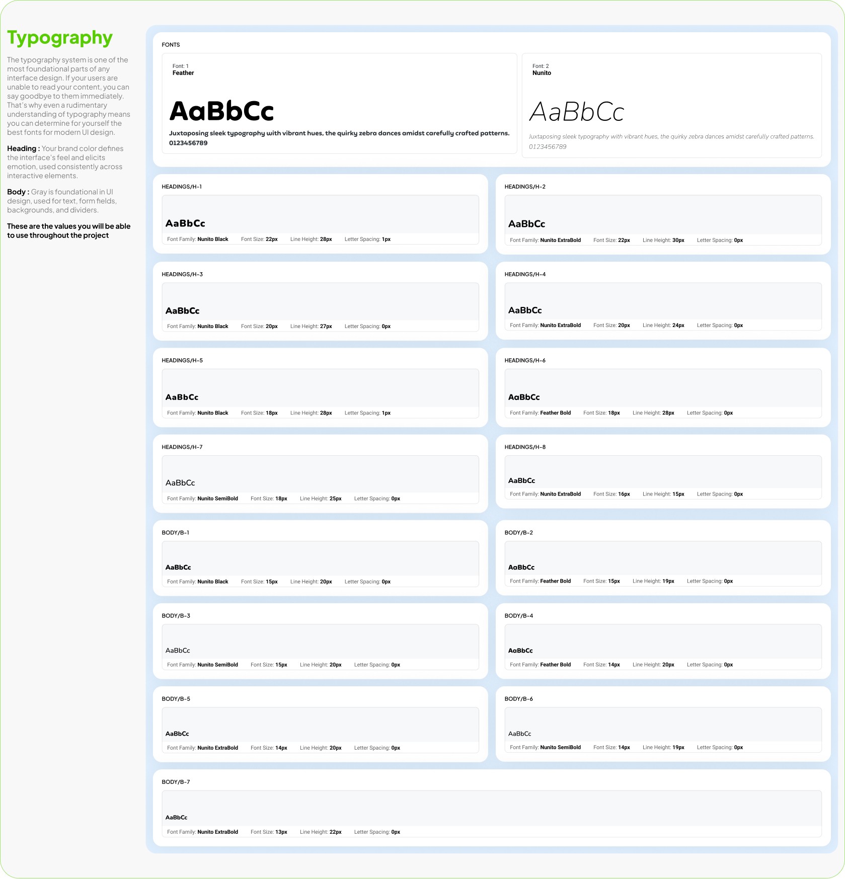
Typography
Clear, friendly typography is at the core of Duolingo’s design. Every font choice was made to support readability and keep the learning experience light and approachable.
Heading : Bold and energetic, guiding learners’ attention to the most important information.
Body : Simple and easy to follow, ensuring lessons feel clear across any device.
Consistency in type ensures that learners stay focused on progress, not on deciphering the interface.
Fonts
Font: 1
Feather
AaBbCc
Juxtaposing sleek typography with vibrant hues, the quirky zebra dances amidst carefully crafted patterns.
0123456789
Font: 2
Nunito
AaBbCc
Juxtaposing sleek typography with vibrant hues, the quirky zebra dances amidst carefully crafted patterns.
0123456789
Headings/H-1

Headings/H-2

Headings/H-3

Headings/H-4

Headings/H-5

Headings/H-6

Headings/H-7

Headings/H-8

Body/B-1

Body/B-2

Body/B-3

Body/B-4

Body/B-5

Body/B-6

Body/B-7

02
Components
Components on Design
Components on Design
6
Day streak
1525
Total XP
What would you like to learn?
one
the man
the cat
the boy
SECTION 1, UNIT 1
Use basic phrases

Sam
@Sam315105
Joint December 2024

+5
Courses
3
Following
2
Followers

Spanish

French


CONTINUE
ADD FRIENDS
GET STARTED
I ALREADY HAVE AN ACCOUNT
The free, fun, and effective
way to learn a language!
05
Components
Mascots Components
High Fidelity Wireframes
At the high-fidelity stage, I focused on how streak progress, rewards, and goal-setting are visually and emotionally communicated during short practice sessions.
The first interaction introduces the Streak Zone, where users see their current streak and upcoming milestones. This screen is designed to immediately reinforce progress and set a clear expectation of what comes next, turning the streak into an active journey rather than a static number.
The second state highlights reward moments, such as earned gems or XP, to create a sense of accomplishment after completing a short session. Visual emphasis, motion, and hierarchy were used to make rewards feel meaningful without overwhelming the user.
The final flow guides users into setting or committing to the next streak goal, presenting milestone options with clear value and tone-based feedback (e.g. “Good,” “Great,” “Unstoppable”). This step closes the loop by encouraging continued commitment while respecting the user’s available time and effort.
Together, these interactions create a lightweight but motivating experience that supports daily consistency, protects streaks, and reinforces habit formation through clear feedback and positive reinforcement.
High-Fidelity Wireframes
User Testing
To validate Quick Practice Mode, I ran usability testing with 8 learners across different backgrounds, including busy professionals, students, and casual users.
Participants completed a 3-minute practice session using a think-aloud method, followed by short interviews to capture feedback and pain points.
Key Insights
Users immediately understood Quick Practice as a faster alternative to regular lessons.
Streak protection was the strongest motivator, especially for users with limited time.
The simplified progress bar helped users clearly understand time remaining.
Some users expected clearer streak confirmation after completing the session.
Outcome
Based on these insights, I refined the completion screen by emphasizing streak continuation and adding a streak badge next to XP rewards, reducing confusion and increasing confidence after each session.
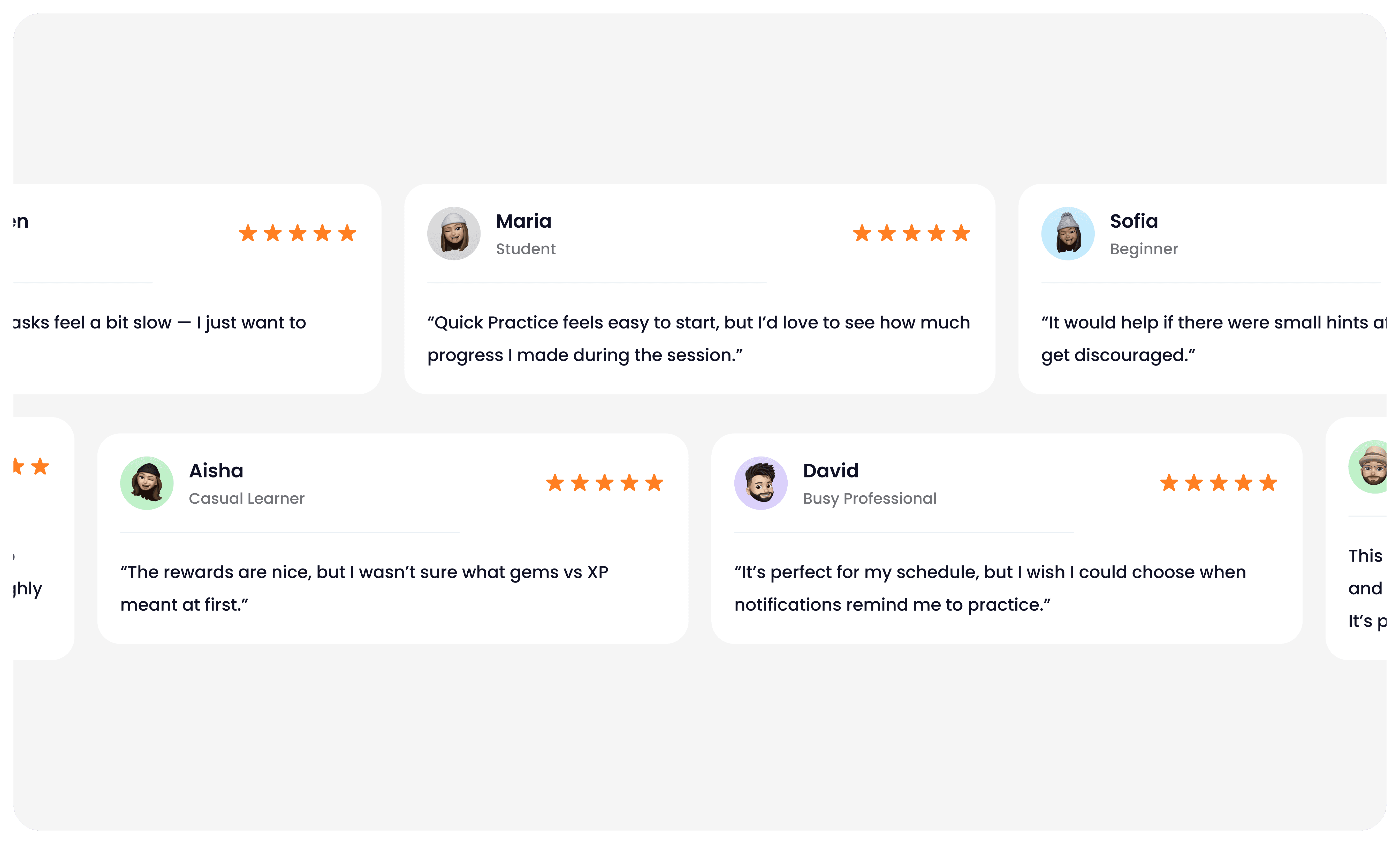
Feedback Summary
After reviewing the high-fidelity prototype of Quick Practice Mode, I gathered qualitative feedback from learners with different goals and experience levels.
The feedback helped validate what was working well and revealed clear opportunities to improve clarity, motivation, and personalization. These insights directly guided the next iteration of the experience.
Final Designs
The final designs translate Quick Practice Mode into a fast, focused experience that fits naturally into Duolingo’s core learning flow.
The goal was to help learners stay consistent on busy days by reducing friction while preserving Duolingo’s playful tone.
Key Design Decisions
One-tap entry to Quick Practice from the home screen to reduce time-to-start.
3-minute sessions built around lightweight exercises and a clear micro-progress bar.
Clear end-of-session rewards, combining XP, streak protection, and gems in a single confirmation moment.
Motivational feedback from Duo to reinforce completion and positive momentum.
These designs balance speed, clarity, and motivation, making daily practice feel achievable without sacrificing engagement.
Final Solution: A Clearer, Friendlier Duolingo Experience
The redesigned Quick Practice flow focused on reducing friction and cognitive load while making progress and rewards more visible.
By simplifying navigation, surfacing progress upfront, and clarifying end-of-session feedback, learners could move through practice sessions more smoothly and with greater confidence.
Clear visual hierarchy, consistent interactions, and improved contrast helped create a cleaner, more approachable experience without losing Duolingo’s playful character.
Outcome & Impact
Usability testing with 8 learners showed clear improvements across key metrics:
Lesson navigation: Task completion improved by 28%, with users finding practice faster.
Progress clarity: 90% of participants clearly understood their streak and XP goals (up from 65%).
Exercise completion: Error rates across the task flow dropped by 25%.
Overall perception: Users described the experience as “cleaner” and “less overwhelming.”
Satisfaction score: Increased from 3.4 → 4.7 / 5.
Impact
By leading the redesign process from early sketches to high-fidelity mockups, I created a simplified learning journey that reduced user frustration and increased engagement. Multiple testing rounds helped validate design changes and refine the flow before final implementation.
This process not only improved Duolingo’s learning experience but also gave me hands-on experience with rapid iteration, usability testing, and presenting results in a measurable way.
What I learned
Clarity over complexity: Simplifying the lesson path made the app easier for both beginners and advanced learners.
Microcopy matters: Small changes in labels (like “Continue lesson” instead of “Start”) improved understanding.
Consistency builds trust: Keeping icons, buttons, and progress indicators consistent across screens reduced confusion.
Test early, test often: Even low-fi prototypes gave valuable feedback before moving into polished visuals.
Accessibility = inclusivity: Adjusting colors, contrasts, and touch targets improved usability across all devices.
B2C mobile app
EdTech / Language learning
Duolingo
In this project, I explored how Duolingo could better support learners who struggle to stay consistent with daily practice. Many users download the app with excitement, but drop off after the first weeks due to time pressure or loss of motivation.
My focus was on redesigning the daily practice flow to fit into short, busy moments. I worked on creating a Quick Practice Mode that delivers meaningful micro-learning in just a few minutes while still rewarding progress.
The design emphasized flexibility, motivation, and simplicity — helping learners maintain their streaks, reduce frustration, and feel a sense of achievement every day, even when they don’t have time for a full lesson.
Daily Practice Flow
Quick Practice
For this project, I redesigned the daily practice flow in Duolingo to help learners stay consistent with their studies. Research showed that many users were losing motivation and dropping their streaks after the first week, often because lessons required too much time to complete.
Quick & Flexible
Complete a meaningful practice session in under 3 minutes — designed for learners with busy schedules.
Streak Protection
Keep your streak alive with short sessions that still count towards daily progress.
Stay motivated
Earn XP, gems, and badges even in Quick Practice Mode to feel rewarded every day.
Short challenges, playful characters, and instant feedback keep the experience enjoyable.
Fun & Engaging
Project overview
Duolingo is a mobile-first, habit-forming learning product where daily engagement and streak retention are core to long-term user success.
As a Product Designer on the Duolingo team, I worked on improving the daily practice experience for learners with limited time, focusing on retention, motivation, and streak continuity.
User research and behavioral data revealed that many mid-stage learners were breaking their streaks not due to lack of interest, but because full lessons felt too time-consuming on busy days. To address this, I helped design Quick Practice Mode — a lightweight, ~3-minute practice session that users could start in one tap directly from the home screen.
In parallel, I worked on the streak zones and milestone experience, designing how progress is tracked, visualized, and emotionally reinforced as users maintain consecutive-day streaks. This included UX logic for streak progression, milestone thresholds (e.g. 3-day, 7-day streaks), and UI patterns such as celebratory animations, reward states, and contextual feedback.
I owned the design end-to-end — from user flows and progress logic to interaction design, animations, and high-fidelity UI — collaborating closely with product and engineering to ensure the experience felt motivating, clear, and consistent with Duolingo’s playful brand while supporting measurable retention goals.
Design Challenge
1
Setting the next meaningful streak goal
Users with long streaks often lose motivation after reaching an initial milestone. Once the excitement of “keeping the streak alive” fades, the product needs a new reason for users to continue practicing consistently.
I designed a goal-setting experience that reframes streaks from a passive counter into an active commitment. Instead of stopping at the current streak, users are encouraged to select a next streak milestone (7, 14, 30, 50 days), with clear qualitative feedback that reinforces progress and confidence.
This step turns streaks into a forward-looking goal rather than a past achievement.
2
Maintaining momentum between milestone
A key drop-off moment happens between streak milestones, when progress feels slow or abstract. Users may still be practicing daily, but without a visible sense of advancement, motivation declines.
To address this, I designed a progressive milestone system that visualizes how close users are to their next streak goal. The experience uses clear visual hierarchy, incremental progress markers, and encouraging microcopy to sustain momentum and answer a simple question:
“Am I getting closer?”
This keeps users emotionally invested even when the next reward is days away.
3
Making streak progress visible and trustworthy
For streaks to feel meaningful, users must trust that their effort is being accurately tracked and recognized over time. Without transparency, streaks can feel fragile or arbitrary.
I worked on the streak tracking experience, combining calendar-based visualization with streak status, freeze usage, and day-by-day confirmation. This gives users a clear historical view of their effort and reinforces a sense of ownership over their learning habit.
The result is a streak system that feels reliable, motivating, and emotionally rewarding rather than stressful.
Research: Understanding Streak Behavior & Daily Practice Motivation
Using research insights, I explored early concepts for Quick Practice Mode and streak progression through low-fidelity sketches and whiteboard flows. I focused on how goal-setting, milestones, and feedback could fit naturally into existing user routines while minimizing friction. Working closely with product and engineering, we aligned on constraints and iterated on multiple directions before translating the strongest concepts into interactive Figma prototypes.
User Persona
To better understand the challenges learners face, I developed a persona that represents a typical Duolingo user. This persona highlights the daily struggles of balancing language learning with a busy schedule, and shows where frustration often leads to dropped streaks.
By focusing on her motivations and pain points, I was able to design a practice flow that feels lighter, faster, and more rewarding — making it easier for her to stay engaged over time.
User Journey Map
I analyzed how learners interact with Duolingo throughout a typical day. From the first moment they open the app in the morning to the final check of their streak at night, the journey shows both motivation and frustration.
The map exposed critical drop-off points — especially when users felt they didn’t have enough time for a full lesson. It also highlighted moments of excitement when progress and rewards were clear. These insights shaped the idea of a Quick Practice Mode, designed to reduce time pressure and make daily learning more achievable.
Information Architecture & User Flow
This flow was designed to remove friction at the exact moment users hesitate to start a full lesson. From the home screen, Quick Practice is positioned as an immediate, one-tap entry into a short session that preserves streaks without requiring a long time commitment. The flow prioritizes speed, clarity, and positive reinforcement — guiding users from intent to completion in under a few minutes, then closing the loop with clear progress and motivational feedback.
Start
Home Screen
Quick Practice Start
Mini Exercise
Completion Screen
Motivational Feedback
Information Architecture/User Flow
Home Screen → User opens the app and sees the new Quick Practice button.
Quick Practice Start → One tap to begin a 3-minute session.
Mini Exercise → Short set of tasks (1–2 questions with fast interactions).
Completion Screen → Shows streak continued, XP earned, gems collected.
Motivational Feedback → Duo the Owl celebrates and encourages the learner.
Design System
While working on Quick Practice Mode, I had to make sure the new flow felt like it truly belonged inside Duolingo. The app has a very strong identity — bright colors, playful illustrations, and Duo the owl driving most interactions. My task was to extend this system without breaking its character.
Colors
Duolingo Green remained dominant, but I introduced a softer yellow accent to signal speed and . short sessions. This created a visual distinction between regular lessons and quick practice.
Typography
Duolingo Sans was kept for consistency, but I prioritized large, bold headlines and reduced text density so users could scan information in seconds.
Components
I designed simplified buttons and micro-progress bars that worked for shorter lessons. Instead of long progress trackers, users saw small step indicators that matched the 3-minute flow.
Mascot & Illustrations
Duo was integrated as a motivator — appearing at the start and end of Quick Practice with supportive messages. These lightweight interactions reinforced the brand’s playful voice while keeping learners engaged.
By adapting the existing system and adding subtle extensions, the new design stayed true to Duolingo’s personality while delivering a fresh, faster experience.
02
Components
Components on Design
Components on Design
6
Day streak
1525
Total XP
What would you like to learn?
one
the man
the cat
the boy
SECTION 1, UNIT 1
Use basic phrases
Sam
@Sam315105
Joint December 2024
+5
Courses
3
Following
2
Followers
Spanish
French
CONTINUE
ADD FRIENDS
GET STARTED
I ALREADY HAVE AN ACCOUNT
High Fidelity Wireframes
At the high-fidelity stage, I focused on how streak progress, rewards, and goal-setting are visually and emotionally communicated during short practice sessions.
The first interaction introduces the Streak Zone, where users see their current streak and upcoming milestones. This screen is designed to immediately reinforce progress and set a clear expectation of what comes next, turning the streak into an active journey rather than a static number.
The second state highlights reward moments, such as earned gems or XP, to create a sense of accomplishment after completing a short session. Visual emphasis, motion, and hierarchy were used to make rewards feel meaningful without overwhelming the user.
The final flow guides users into setting or committing to the next streak goal, presenting milestone options with clear value and tone-based feedback (e.g. “Good,” “Great,” “Unstoppable”). This step closes the loop by encouraging continued commitment while respecting the user’s available time and effort.
Together, these interactions create a lightweight but motivating experience that supports daily consistency, protects streaks, and reinforces habit formation through clear feedback and positive reinforcement.
High-Fidelity Wireframes
User Testing
To validate Quick Practice Mode, I ran usability testing with 8 learners across different backgrounds, including busy professionals, students, and casual users.
Participants completed a 3-minute practice session using a think-aloud method, followed by short interviews to capture feedback and pain points.
Key Insights
Users immediately understood Quick Practice as a faster alternative to regular lessons.
Streak protection was the strongest motivator, especially for users with limited time.
The simplified progress bar helped users clearly understand time remaining.
Some users expected clearer streak confirmation after completing the session.
Outcome
Based on these insights, I refined the completion screen by emphasizing streak continuation and adding a streak badge next to XP rewards, reducing confusion and increasing confidence after each session.
Feedback Summary
After reviewing the high-fidelity prototype of Quick Practice Mode, I gathered qualitative feedback from learners with different goals and experience levels.
The feedback helped validate what was working well and revealed clear opportunities to improve clarity, motivation, and personalization. These insights directly guided the next iteration of the experience.
Final Designs
The final designs translate Quick Practice Mode into a fast, focused experience that fits naturally into Duolingo’s core learning flow.
The goal was to help learners stay consistent on busy days by reducing friction while preserving Duolingo’s playful tone.
Key Design Decisions
One-tap entry to Quick Practice from the home screen to reduce time-to-start.
3-minute sessions built around lightweight exercises and a clear micro-progress bar.
Clear end-of-session rewards, combining XP, streak protection, and gems in a single confirmation moment.
Motivational feedback from Duo to reinforce completion and positive momentum.
These designs balance speed, clarity, and motivation, making daily practice feel achievable without sacrificing engagement.
Final Solution: A Clearer, Friendlier Duolingo Experience
The redesigned Quick Practice flow focused on reducing friction and cognitive load while making progress and rewards more visible.
By simplifying navigation, surfacing progress upfront, and clarifying end-of-session feedback, learners could move through practice sessions more smoothly and with greater confidence.
Clear visual hierarchy, consistent interactions, and improved contrast helped create a cleaner, more approachable experience without losing Duolingo’s playful character.
Outcome & Impact
Usability testing with 8 learners showed clear improvements across key metrics:
Lesson navigation: Task completion improved by 28%, with users finding practice faster.
Progress clarity: 90% of participants clearly understood their streak and XP goals (up from 65%).
Exercise completion: Error rates across the task flow dropped by 25%.
Overall perception: Users described the experience as “cleaner” and “less overwhelming.”
Satisfaction score: Increased from 3.4 → 4.7 / 5.
Impact
By leading the redesign process from early sketches to high-fidelity mockups, I created a simplified learning journey that reduced user frustration and increased engagement. Multiple testing rounds helped validate design changes and refine the flow before final implementation.
This process not only improved Duolingo’s learning experience but also gave me hands-on experience with rapid iteration, usability testing, and presenting results in a measurable way.
What I learned
Clarity over complexity: Simplifying the lesson path made the app easier for both beginners and advanced learners.
Microcopy matters: Small changes in labels (like “Continue lesson” instead of “Start”) improved understanding.
Consistency builds trust: Keeping icons, buttons, and progress indicators consistent across screens reduced confusion.
Test early, test often: Even low-fi prototypes gave valuable feedback before moving into polished visuals.
Accessibility = inclusivity: Adjusting colors, contrasts, and touch targets improved usability across all devices.